Form & Funktion

Form and Funkton is yet another design editorial, a bloggology, the rantings of a designer on design as it relates to trends, usability, society, and inner space.

Tuesday, March 20, 2007


Bo Coffee Table

Here's another nifty multi-purpose coffee table from Bo Concept. As much as I like this table, I don't think it'll work for Gary's and Jessica's place for several reason.


1) It's rectangular. They really need a round table. A round table opens up a space while a rectangle or square table makes you want to visually box in the sitting area. It has a similar effect as a rug.


2) It's not glass. Since they got this mammoth leather sofa, they really need to offset it with something that's open and airy. Another blocky solid piece will just make the space look boxy, narrow, and small. This would only work if their sofa was smaller scale or lifted off the floor with legs.
Big couches can happen to the nicest people.

Friday, March 09, 2007


Meet Wallter!


We've all seen these trendy wall applications, but this takes it to a new level.

What a cool way to display your photos. Notice that all the photos are black and white. Minimalism is at work here and color photos would not have the same unifying effect as black and white.
Priced at $42 per set at Wallter.


Why didn't I think of this before?


I've had the Hydra table bookmarked for about 2 years already. Couldn't believe I'd forgotten all about it. This would make a great piece for my friends', Gary and Jessica's place. Perhaps it's a bit too modern for Jessica, but in terms of functionality, it serves several purposes. The table height can be adjusted up and down from 17" to 25", or you can use the optional extension piece to jack it up to 29", which is the height of a dining table.

Saturday, February 24, 2007


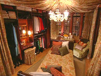
Everytime I see someone do one of these canopy looking rooms, all I can think of is that it will look good for only the first few months. After that, the fabric gets discolored or stained and dust will collect in every fold of the fabric.

Nate Brekhus redesigned this 200 sq. foot space for one of Oprah's viewers. I admit that he's got a lot of things right, like built-ins and multi-use pieces. However, he could've easily used sliding doors with frosted glass insets in lieu of curtains. That would still achieve Nate's goal of trying to hide away unused functions such as the mini kitchen or closet. In addition, the frosted glass would make make the room seem more spacious and let more light into the room.

I am a Nate Brehus fan, but he falls short in this challenge. Check it out on the Oprah site.


Urban Outfitters Bohemian Chic
Amongst all the low cost furniture distributers, Urban Outfitters is the most original. Like UO's clothing line, the furniture and home line is edgy, artistic, retro, and oh so affordable. The feeling is of organized chaos -- things that shouldn't work together somehow do. UO is truly the Ugly Betty of interior design.
The Photo Screen shown is priced at $240. You can use it to divide up a room or flatten it out and use it as art.

Sunday, February 18, 2007


Cowhide: Passing Fad or Here to Stay

Maybe I'm wrong but to me cowhide is not the same as leopard skin or tiger skin. Those latter skins are so over the top, so Vegas. They're like highly paid prostitutes of design. Cowhide is simpler and cleaner in aesthetics. Maybe cowhide just has better marketing. Who knows?!

I've been looking at this chair for about 6 months. In terms of comfort, although it is not your plush cushioned recliner, it is a lot more comfortable than it looks. The back pivots so you can recline a bit.

I like the cowhide covering, because without it, the chair seems a bit cold. This chair normally comes in a black leather, and black leather always says bachelor pad to me. Also, the cowhide is an unexpected use of the material, which is what I always like to do. I want to put items that don't usually go together and make them work just by the merit of scale, color, and texture.

Right now, I'm diggin' it.


Blue is definitely in.

Imagine this with a glass table on top. You'll get an icy blue, sea glass feeling.

Love the graphical look of this Sleepy Hollow Rug from CB2. Love it even more when the price is good. Only $299 for a 5x8. ...


Gorges Stool

I purchased this stool from ModAbode last December. It is bigger than it looks and the curved inset for the seating area is quite comfortable. Love it for its clean lines and modern aesthetics, although my place is not all modern.

At $119.99, it is a good value. ModAbode delivered it on time and in good condition.

Thursday, August 31, 2006


The A Chair

Made of galvanized steel, this chair was first designed in 1934 by Xavier Pauchard. It pre-dates even the Eames lounge chair. Classic design never goes out of style.

The best part is that it is only $175 at the Conran Shop.

Friday, August 04, 2006

Let's PLAY!


This product was made for my brother who is -- part lego lover, part techno geek, and part home improvement nut. Perhaps he feels that he's moved on from legos to the cool stainless steel toys to fully embrace this product. I know the adult decorator in him is saying, "Will it go with my sophisticated Restoration Hardware chair?" I think it's kick-ass cool! Made from a biodegradable green material called ARPO, the configurations are limited only by your imagination. PLAY comes in 6 exciting colors: pink, gray, black, white, orange, and yellow. When you get bored, just reassemble!

Monday, July 31, 2006

Chronicles of a Not-So-Newbie Interior Designer: Den/Living Room Furniture and Accessories

Blue Watercolor Painting of Chicago (Homeowner's)
Blue and White Porcelain Figurine (Homeowner's)
Bronze Picture Light (similar light can be purchased at Home Depot, Lowes, or Lamps Plus)
Carlton Wall Clock
Blue and White Plates
Cortland Pharmacy Table Lamp or Vaughan Table Lamp in bronze (for desk area)
Alexis Table Lamp in blue (for side table)
Livia Chair in Morton Mist fabric
Mingshi Table
Brooklyn Console Table
Bedford Small Desktop (Desktop only in Mahogany Stain)
Bedford CPU Cabinet (in Mahogany Stain)
Bedford Lateral File Cabinet (in Mahogany Stain)
Bedford 2-Shelf Bookcase (in Mahogany Stain)
Louis Chair or Swivel Desk Chair (in black with cushion in Gold Hudson Stripe )
Taylor Ottoman (in Walnut)

Chronicles of a Not-So-Newbie Interior Designer: Den/Living Room


In lieu of a living room, the client wanted the space to be used primarily as a den. However, I've designed the room so that it could serve both functions. I intentionally did not include a desk chair in the sketch so that there's a clear view of the office area. The desk, shelf, and file cabinet are modular units from Pottery Barn. They've been put together to simulate a built-in. There's roughly 7-8 inches remaining on both sides, just enough space for a shredder or garbage can. Under the console table are two cube ottomans that can be used for additional seating or could be used as footrests for the two side chairs.